Basselope is a project I recently worked on alongside two other developers, Ben Chen and Rico Chen. It's a data analytics tool that visualizes sentiment / tone of content from a range of sources...
Ben and I intend to continue work on the project starting next week, but we have reached a state of completion at which I'd like to write a little about what went well, as well as what hasn't gone so well.
A live version of the app: basselope.io
It's open source! Check out the repository on github if you'd like to contribute.
Abstract
Basselope draws in a large set of text-data from a variety of sources. Using natural language processing and statistical analysis, that content is then passed through multiple filters that clean, process, and extract metrics on the tone, quality, and impact of each data point.
Samples that pass an initial quality-of-language filter are then tokenized to score each word by the strength of its link to the topic. The strength of that link is used as a layer of confidence when calculating tone-weight and sentiment with the help of the AFINN-111 word bank.
The result of our process is a set of normalized, enriched data points that can be graphed by multiple metrics including time, sentiment, weight, notoriety, and quality. This allows for multiple dimensions of inference in the form of more complex visualizations.
Results
The results of the work put into Basselope v1.0.0 (three weeks) is what I would regard as a 'proof of concept' MVP of what we envision the project developing towards.
Being such a short development period from start to feature-freeze, shortcuts were taken and features were deferred. However, that isn't to say we didn't accomplish much, in fact, I'm impressed by what we have achieved in such a short time-frame with such a small team.
Accomplishments
Most importantly, our algorithm is in a working state, returning results (positive or negative) that align with what we infer the results to be. When processing sufficiently large data sets, we've found that having a tone of ±5/100 is a statistically significant indication of positivity or negativity.
Search terms return, on average, two hundred to five hundred samples. Typically queries enter our algorithm with upwards of five hundred, in some cases thousands, of data points which are then filtered down by 20-50% before being further processed.
At present, Basselope is aggregating data from three sources:
On the client, we have three visualizations built using D3, more on the way. The breadth of our data gives us a lot to work with when it comes to meaningful and creative insight.
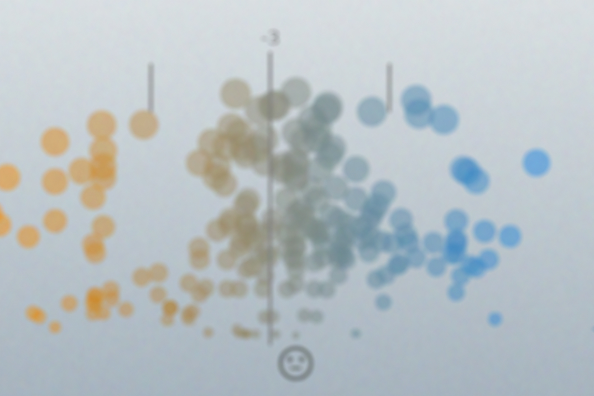
Weighted Sentiment & Impact (scatter plot distribution graph)
Plots all data points along X-axis by sentiment (-100 to +100). The Y-axis and size of each plot-point representing the noterietay and weight.
Sentiment Extremes Over Time (timeline stream graph)
Clumps and averages data points by day (positive / negative), and generates a path with labeled extrema (date and sentiment value -100 to +100).
Related Topic By Reference (pie chart, always have a pie chart)
Our algorithms also extracts related topics discussed alongside the target topic; the top 5 values are placed on a pie chart along with the total number of references.
Technical Challenges & Future Goals
The diversity of data structures returned by our resources presented a significant level of complexity in our initial design. While we are still working on improving this aspect of our process, we have developed a harmonious structure that improves the dryness of code further down the pipeline.
Our current structure parses the retrieved data without tossing out important values, but for some sources, it results in many null property values. This is a major pain point that needs to be addressed before implementing persistent storage of results. For this reason, and for lack of time, Basselope v1 does not utilize a database.
Another aspect of our aggregation methods that needs to be addressed is the chronological spread of data. This is where a database would be particularly handy. We've been working on designing SQL tables and query plans to implement with PostgreSQL in the next major version.
While the spread of our data is much better than it was early in development (after minor tweaks to query params), it's still clumpy... The issue with chronologically clumpy data is that it doesn't graph well. We had to do some less than kosher things when implementing our timeline visualization that we hope to rectify in the near future.
Currently, most data processing is handled by the server. This will remain the case moving forward primarily due to variable performance of client-machines. Currently, the client-side performance of our code, in particular SVG animations / transitions, is rather poor when handling large sample sizes.
One of our biggest stumbling blocks that frequently crippled productivity was the client-side tech stack. We're using React, React-Router, Redux and D3. For those who are unfamiliar with React, it doesn't play well with libraries that touch the DOM (ie. D3).
We though that just getting React to show our graph(s) would be the biggest challenge, we were wrong... The real trial began when we began implementation of routing and state management. I'm considering authoring a post titled '101 Ways How NOT to Build Apps with React & D3' -- stay tuned.
As we work through these challenges, I'll discuss them in greater detail as future articles.
The Take-Away
The most rewarding aspect of this project as been watching the data and visualizations reflect and model popular opinion on recent events. I'm proud of what we have accomplished so far and look forward to continuing development on Basselope.
If you have any feedback or would like to get involved in the project, I'd love to hear from you!
